Accessible Content Checklist for Editors: Make Every Article Easier to Use
A clear page is easier for everyone to use. This guide shows how to check headings, links, images, and mobile text before a post goes live.
Why accessible content needs an editorial check
A clear article helps more people than one that only looks good on a large screen. Some readers use a screen reader. Some zoom in on a phone. Others read in a second language, use a keyboard, or have a slow link. Each person needs the same core answer, but may reach it in a different way.
Content teams can improve this without a full site rebuild. Start with the words, headings, links, and images that an editor controls. Then check how the page works with the site theme. This guide gives you a repeatable review that fits into a normal publishing day.
The need is real. The WebAIM Million 2026 study found 56.1 detected accessibility errors per home page across one million home pages. That figure measures issues found by an automated tool, not every barrier a person might face. It still shows why a quick visual glance is not enough.
Step 1: Put the answer near the start
Open your draft as if you know nothing about the brand. Can you tell what problem it solves in the first few lines? If the answer is hidden below a long story, move it up.
For a guide on choosing an email tool, the first paragraph might state who the guide helps, what choices it covers, and how to use the comparison. A visitor should not need to scan half the page to learn whether the article is relevant.
Keep each paragraph focused on one idea. A short paragraph can give a direct answer. A longer one may explain a trade-off, a test, or a step. Both are useful. The goal is a steady reading path, not a fixed sentence count.
The W3C Web Accessibility Initiative advises clear language, meaningful headings, and link text that makes sense on its own. This also helps readers who skim.
Step 2: Use headings as a map

Think of headings as labels on drawers. A reader should know what each one holds. The page title is the H1. Main questions or tasks are H2 headings. An H3 belongs under an H2 when a step needs its own smaller part.
Do not choose an H3 only because its font looks small. Heading levels have a job. They tell assistive software how the ideas fit together. Use CSS or editor styles to change the look.
Try this quick test: copy only the headings into a note. Can a person follow the article from that outline? If two headings say almost the same thing, make their roles clearer. “Pick a goal” and “Choose a useful measure” work better than “Things to know” and “More things to know.”
Step 3: Make every link useful out of context
Replace vague calls to action
A screen reader user may move through links apart from the main text. “Click here” gives no clue where a link goes. A phrase such as “read the W3C image text guide” tells the reader what to expect.
Links should also be easy to spot. Color alone may not be enough. An underline or another clear visual cue helps. Before you publish, open each link, check the destination, and make sure the wording still fits.
A common editing mistake is placing five links on the same short phrase. This makes the sentence hard to use. Pick the most helpful source and put it where it supports a claim. If a reader needs more detail, link the name of the source in the sentence.
Step 4: Write image text for the purpose
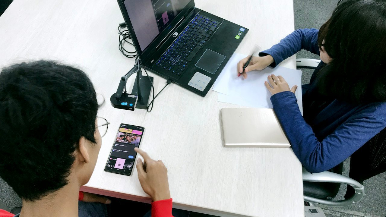
An image may teach, prove, or decorate. Those roles call for different treatment. If a chart shows a key result, explain that result in the body and give a concise text alternative. If a photo shows an editor testing a page on a phone, describe the meaningful scene. If a shape is only for style, it may need an empty alt attribute so it does not add noise.
The W3C image tutorial explains that the right text depends on why an image appears. “Image of” is often a wasted start. A useful alt for a workflow screenshot might be “Article editor with the heading panel open and the H2 level selected.”
Do not stuff the focus keyword into every image description. Search terms should not replace a clear account of what the image shows. Captions can add context, but they do not always do the same job as alt text.
Step 5: Check color, zoom, and mobile reading

Preview the article on a small screen. Make the text larger. Turn the phone sideways. Look for words cut off by a table, a button that sits beyond the edge, or a chart with labels too small to read.
A pale gray sentence on a white background may seem neat, yet be hard to read. Ask the design team to check contrast against the current WCAG guidance. Content editors can flag problems even when they cannot change the theme.
If you use a table, keep it small enough to work on a phone. Put a plain-language summary before or after it. A table with many columns may need to become separate short sections on mobile.
The point is not to make every page look the same. It is to keep the meaning intact as a reader changes the size and way they view it.
Step 6: Test a page without a mouse

Put your mouse aside. Press Tab to move through links and controls. Can you see where the focus sits? Can you reach the navigation, search, article links, and forms? If focus jumps in a strange order, note the exact spot for a developer.
Next, use a screen reader if one is available. Windows has Narrator. Apple devices include VoiceOver. You do not need to become an expert in one session. Listen to the page title, headings, link names, and image text. Ask whether the main task is clear.
Automated tools are helpful for catching some problems, but they cannot tell whether a paragraph answers the reader’s question. They also may not know whether an image description is meaningful. Pair a scan with a short human test.
A real editorial review: a product comparison
Imagine a small team writing a guide to two project tools. The first draft opens with three paragraphs about the history of teamwork. Each product section has the heading “Features.” Screenshots have file names as alt text. The final call to action is “Learn more.”
The editor begins with the reader’s choice: which tool suits a solo worker and which suits a team that needs approvals? The introduction now states that scope. The H2 headings name the decisions, such as “Which tool is easier to set up?” and “How do shared tasks work?”
The editor changes each link to name its destination. A screenshot gets a short description of the setting it demonstrates. A comparison table gets a plain summary. On a phone, the wide table is replaced with compact notes.
Nothing in this example requires invented test results. If the team has not used both tools, it must say that it compared public product documentation. If it did test them, it can describe the device, plan, and date. That distinction gives readers a fair view of the evidence.
A 20-minute review before publishing
A simple team workflow
For a standard post, a small team can split the check into short blocks. The exact time will vary with page length and design.
- Minutes 1–4: read the title, opening, and headings without scrolling through every paragraph.
- Minutes 5–8: inspect links, citations, and claims that need a source.
- Minutes 9–12: review image purpose, alt text, and captions.
- Minutes 13–16: test phone layout, zoom, and basic keyboard use.
- Minutes 17–20: fix easy issues and log theme-level problems for the owner.
If a review reveals a broken form or unreadable text, hold the post until it is fixed. If the problem is outside the editor’s control, make a clear ticket with the page, device, and steps to reproduce. “Button is bad” is less useful than “On a 320-pixel screen, the subscribe button overlaps the input field.”
Common mistakes and how to avoid them
One mistake is adding alt text to every decorative mark. That can force screen reader users to hear a stream of unhelpful labels. Another is using bold text instead of a true heading. The page may look organized to sighted readers yet have a flat structure in assistive software.
Teams also rely too much on automated scores. A green badge does not prove that a page is easy to use. A test may miss a confusing question, a vague link, or a chart that needs explanation. Treat a score as a signal to investigate, not as a final verdict.
Do not make the review a blame exercise. A writer may handle words and links while a designer handles contrast and a developer handles keyboard behavior. Give each issue an owner. Track repeated faults so the next template or workflow can prevent them.
How to make the habit stick
Start with the five pages people visit most. Use your analytics data to choose them, but include one important task page even if traffic is low. Fix the clearest barriers first. Then add a short accessibility check to the content brief and final editorial review.
Keep examples from your own site. Show writers a good H2 outline, a useful link label, and two clear alt-text examples. A short shared guide works better than a long rule book that no one opens.
Review the process after a month. Count issues caught before publication and issues found after a post goes live. These are internal process measures, not proof of full compliance. Ask real readers for feedback when possible.
Accessible content is a form of good service. A page should answer a question in a way that people can find, read, and use. When that becomes the team’s default, fewer fixes are left for the end.