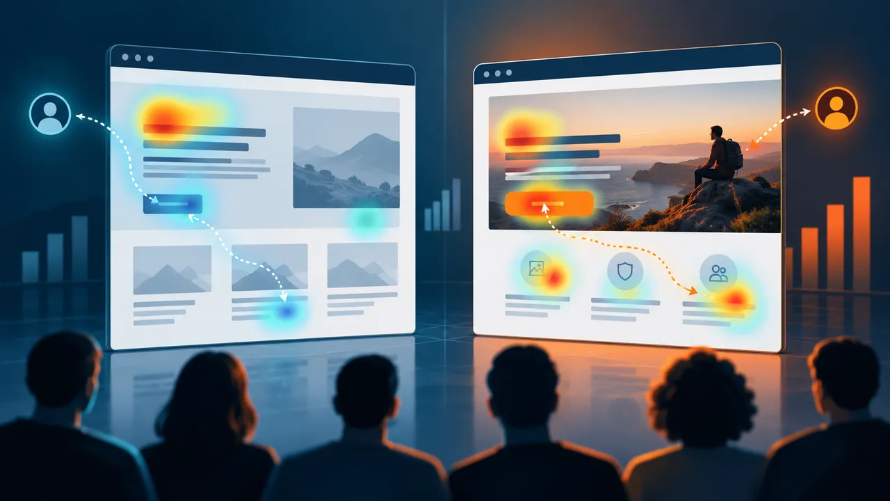
Landing Page Conversion Optimization in 2026: A Practical Testing Framework That Avoids Guesswork
A landing page can attract the right visitor and still lose the conversion. The ad may promise a free estimate while the page opens with a generic company slogan. The form may ask for ten fields before explaining what happens next. A mobile user may wait for a hero video while the call-to-action sits below the fold. These are not “design taste” problems. They are friction problems.
Conversion optimization is the process of finding that friction and reducing it without damaging lead quality. In 2026, landing pages often serve traffic from paid search, social ads, creator campaigns, email, AI-assisted discovery, and organic search. Each source brings different expectations. A useful CRO process therefore starts with intent and message match, not button color.
This guide gives you a repeatable framework for auditing and testing landing pages. It focuses on changes that help real users understand the offer, trust the business, and complete the next step.
Define the Conversion Before You Optimize the Page
A page cannot be optimized if nobody agrees on the desired action.
Examples of primary conversions
- Purchase
- Demo request
- Quote request
- Trial signup
- Newsletter subscription
- App download
- Appointment booking
Choose one primary action. Secondary actions can exist, but the page should make the main path obvious.
Measure quality, not only volume
If a shorter form doubles leads but most are unqualified, the conversion rate improved while the business result became worse. Connect the page to downstream metrics such as qualified leads, booked calls, completed purchases, activation, or revenue.
Check Message Match From Source to Page
Message match means the landing page continues the promise that caused the click.
Example
An ad says, “Get a same-day website speed audit.” The landing page headline says, “Digital Solutions for Modern Businesses.” The visitor has to work out whether the promised audit even exists.
A stronger page would immediately confirm the offer: “Get Your Same-Day Website Speed Audit.” The supporting text can explain what is included, how long it takes, and who performs it.
Audit each traffic source
Review the main ad, email, search query, or social post that sends traffic. Ask whether the first screen repeats the same problem, outcome, audience, and next step.
Make the First Screen Do Real Work
The first screen does not need to explain everything. It needs to answer the most urgent questions quickly.
Include the essentials
- What is this?
- Who is it for?
- What useful outcome does it provide?
- What should I do next?
- Why should I trust this offer enough to continue?
Use a clear headline, short supporting copy, a visible primary action, and one meaningful proof element where appropriate.
Write Headlines Around the Visitor’s Problem
Internal brand language often produces weak landing-page headlines. Phrases such as “Empowering Digital Transformation” sound broad because they are written from the company perspective.
A practical headline formula
State the outcome, audience, or problem in plain language.
For example, “Bookkeeping for Freelancers Who Want Clean Monthly Records” tells the visitor more than “Financial Clarity for the Future.”
Do not overpromise
Trust disappears when a headline guarantees results the business cannot control. Use specific benefits without invented certainty.
Place Proof Near the Decision It Supports
Trust signals are more useful when they answer a question at the moment it appears.
Near the headline
Use a recognizable client category, accreditation, years of experience, verified rating, or concise outcome if it is genuine and relevant.
Near pricing
Clarify refund terms, guarantees, cancellation rules, and what is included.
Near the form
Explain response time, privacy expectations, and what happens after submission.
A wall of logos at the bottom of the page cannot compensate for uncertainty earlier in the journey.
Use Testimonials That Contain Useful Detail
“Great service!” does little work. A stronger testimonial explains the situation, process, and result.
Useful testimonial structure
“We needed to migrate our store without losing product URLs. The team mapped redirects, tested checkout, and completed the move over a weekend. Our launch went live Monday without order interruption.”
Keep testimonials authentic. Do not invent names, companies, or outcomes. Where permission exists, add real identity details that help readers understand who the customer is.
Reduce Form Friction Without Destroying Lead Quality
Forms are a common conversion bottleneck because every field asks for effort and trust.
Ask only what you can use now
If the sales team does not need a street address before the first conversation, do not collect it. If company size affects routing, that field may be valuable.
Use progressive qualification
For complex B2B services, a short first step can collect contact information and one qualification field. A second step can ask project details when the visitor is already committed.
Make error messages specific
“Something went wrong” forces users to guess. Tell them which field needs attention and preserve the data they already entered.
Explain What Happens After the Click
Uncertainty reduces action. A button that says “Submit” does not tell a visitor what follows.
Better call-to-action language
Use labels such as “Get My Estimate,” “Book a Demo,” “Start the Free Trial,” or “Download the Checklist” when they accurately describe the action.
Set expectations
Below the form, explain response time and next steps. For example: “We will review your request and reply within one business day. No sales call is scheduled until you choose a time.”
Design for Mobile Before You Approve Desktop
Many landing pages are reviewed on a wide desktop monitor even though most ad clicks arrive on phones.
Mobile checks
- Can users read the headline without zooming?
- Is the primary action visible early?
- Are form fields easy to tap?
- Does a sticky banner cover the CTA?
- Do comparison tables remain usable?
- Are phone and email fields using the correct keyboard type?
- Does the hero image load quickly?
Test on a real mid-range phone and normal mobile network conditions, not only a browser emulator.
Speed Is Part of Conversion Optimization
A slow page loses people before copy or design can work.
Use PageSpeed Insights and real-user analytics to check load and interaction problems. Compress oversized images, avoid autoplay backgrounds when they add little value, reduce unnecessary third-party scripts, and keep the main above-the-fold content easy to discover.
Prioritize the first meaningful content
A landing page does not need every testimonial, animation, and tracking tool before the headline and CTA can appear.
Remove Navigation When It Helps the Task
Some dedicated campaign pages convert better with reduced navigation because the visitor has one focused job. Other pages need normal navigation because users want to research the brand before acting.
Decide based on risk and intent
A low-risk newsletter signup may need very little exploration. A high-value consulting engagement may benefit from links to case studies, about information, pricing context, and credentials.
Do not remove useful trust paths just because an old CRO checklist says landing pages should have no navigation.
Use Comparison Sections for High-Consideration Offers
Visitors often ask, “Why this option instead of the alternative?” Answer directly.
Useful comparison dimensions
- Who each option is best for
- Setup time
- Pricing model
- Support
- Customization
- Contract length
- Included features
A fair comparison can increase trust more than pretending alternatives do not exist.
Address Objections Before the Form
Talk to sales and support teams. Ask what prospects hesitate about most.
Common objections
Price, implementation time, cancellation, integrations, privacy, learning curve, support, eligibility, and whether the service works for a specific type of business.
Add concise answers where the objection naturally appears. A good FAQ section is not filler; it removes decision friction.
Track Micro-Conversions Carefully
Not every useful action is the final conversion. Scroll depth, pricing-table interactions, video plays, calculator use, and form starts can help diagnose behavior.
Do not mistake micro-events for success
A page with many button clicks but few completed forms may have a broken or confusing second step. Use micro-conversions to find friction, not to inflate performance reports.
Build an Experiment Backlog From Evidence
Random testing wastes traffic. Create test ideas from observed problems.
Sources of evidence
- Analytics drop-off
- Session recordings where legally appropriate
- User interviews
- Sales objections
- Form abandonment
- Mobile usability problems
- Search query mismatch
- Support tickets
Write the hypothesis in one sentence: “If we clarify setup time next to the pricing section, more qualified visitors will start the trial because implementation uncertainty is a common sales objection.”
Run A/B Tests With Enough Discipline
An A/B test compares a control with a variation. The test should change something meaningful enough to affect behavior.
Avoid tiny tests too early
If the offer is unclear, testing blue versus green buttons is unlikely to solve the problem. Test the value proposition, form structure, proof, offer framing, or page sequence first.
Do not stop when one version briefly leads
Run experiments long enough to capture normal variation. Consider weekday effects, campaign changes, and sample size. Use your testing platform’s statistical guidance, but apply business judgment too.
Use Qualitative Research When Traffic Is Low
Small businesses may not have enough traffic for frequent A/B testing. That does not mean CRO is impossible.
Low-traffic methods
- Interview recent customers.
- Ask sales what questions appear before purchase.
- Run five usability sessions.
- Review failed-search queries and support tickets.
- Compare high- and low-performing lead sources.
Use the findings to make larger evidence-based improvements rather than waiting months for a tiny test.
A Real-World Example: Fixing a Quote Page
A home-services company runs paid search to a “Request a Quote” page. Traffic is healthy, but form completion is low.
The audit finds four problems: the ad promises same-day estimates but the page does not mention timing; the hero image is 3 MB; the form asks for twelve fields; and the only testimonial sits below a long company history section.
The company compresses the hero image, changes the headline to confirm same-day estimate availability, reduces the first form step to five necessary fields, adds a real customer testimonial near the form, and explains what happens after submission.
The test is not “new design versus old design.” It is a set of changes tied to clear friction points. Lead quality is monitored alongside completion rate.
Landing Page CRO Checklist for 2026
- Define the primary conversion and downstream quality metric.
- Check message match from source to first screen.
- Use a clear, specific headline.
- Show the primary action early.
- Place proof near the decision it supports.
- Remove unnecessary form fields.
- Explain what happens after submission.
- Test the page on real mobile devices.
- Improve load and interaction speed.
- Answer major objections.
- Track micro-conversions for diagnosis, not vanity reporting.
- Build tests from evidence and monitor lead quality.
Conclusion: Conversion Optimization Is Friction Reduction
The best landing pages do not use tricks. They reduce confusion. They confirm the promise that brought the visitor, explain the offer in plain language, show believable proof, make the next step easy, and remove unnecessary technical or form friction.
Use analytics to find where people drop. Use customer conversations to understand why. Test changes that address those reasons. Then judge the result by qualified outcomes, not by a single percentage on a dashboard.
That process creates landing pages that convert because they are easier to understand and easier to trust, not because they followed a collection of cosmetic hacks.