
Email Preference Center: Let Subscribers Choose What They Receive
People should choose which emails they get. A clear settings page gives them control, cuts unwanted mail, and helps them stay on the list by choice.
Why a preference page helps both sides
A person may like your advice but not want an email every day. If their only choice is to keep all mail or leave the list, they may unsubscribe even when some updates are useful. A preference center gives them a clear way to choose the topics and pace that suit them.
For a small publisher, this can be as simple as two topics and one frequency choice. A complex form is not a sign of better marketing. It can make the reader work too hard. The goal is to respect the choice and make sure the email system acts on it.
A preference page is not a substitute for a plain unsubscribe link. Readers must still be able to stop marketing email. It is one part of a fair email program, alongside consent, useful messages, and clear sender details.
Start with the emails you actually send
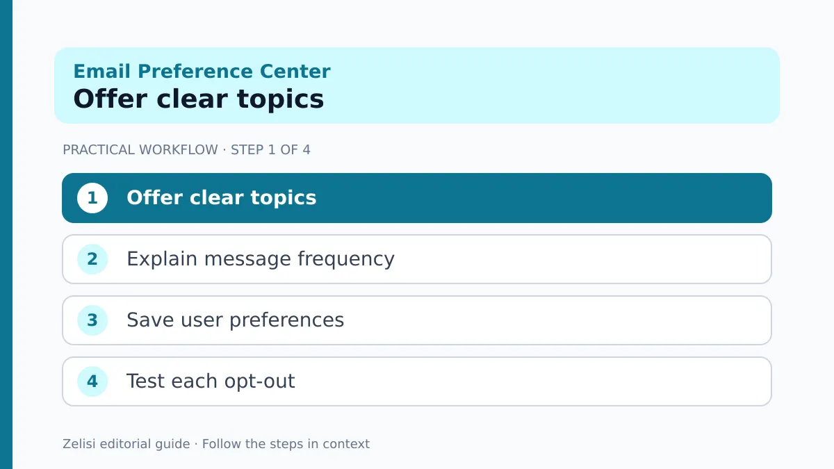
Open the last month of campaigns. Group them by purpose, not by the name of the team that wrote them. A software firm may send product tips, service notices, events, and promotions. Some are optional marketing messages; others may be account or service updates.
Do not let a preference page blur this difference. A reader who leaves a marketing list may still need a receipt or an essential account alert. Your privacy and legal team should decide how each message type is handled in the places where you operate.
Ask whether subscribers would recognize the topic names. “Product news” is clearer than “Lifecycle stream B.” If the business has one newsletter, it may not need a topic menu yet. It may need only a simple frequency choice or a clear explanation of what subscribers will receive.
Build the page around real reader choices, not the internal chart of your organization.
Offer fewer, clearer choices
Too many checkboxes can make people give up. Start with a small set you can reliably honor. A practical page might offer weekly tips, new product updates, and occasional event news. Each label should say what kind of email will arrive.
If you offer frequency, define it. “Weekly digest” should not be followed by three extra marketing emails in the same week. If urgent notices are separate, explain that in plain terms.
A person may want to pause emails for a time. If your platform supports this, make the length clear and resume only as promised. Do not add a pause option that your team cannot implement.
Avoid pre-checking every option when someone edits their choices. Show what is currently saved and let the person change it. A good preference page feels like a control panel, not a sales pitch.
Make unsubscribe fast and easy

A reader who wants to leave should not have to sign in, answer a survey, or call support. The unsubscribe path should be easy to find and should work on a phone. You can offer topic choices on that page, but do not hide the complete opt-out.
Gmail’s sender guidelines set specific requirements for bulk senders, including one-click unsubscribe for relevant marketing and subscribed messages. Those technical requirements are separate from a visible unsubscribe link in the message body. Check the current guidance with your email provider.
Do not assume a preference center alone meets a one-click requirement. That feature uses the message’s email headers and needs proper provider support. Test it with real mailbox accounts before relying on it.
A smooth exit is part of a respectful relationship. People who leave with no friction are less likely to mark a message as spam out of frustration.
Connect the form to the sending system
A practical setup and review
A pretty page is useless if the saved choices do not change who receives the next campaign. Map every visible option to a field or segment in the email platform. Give each field a clear name and one purpose. Avoid two fields that mean almost the same thing.
Test a few sample contacts. Choose only tips for one. Choose only events for another. Unsubscribe the third. Send a test campaign to each group and confirm that the right messages arrive or stay blocked.
Do not use a one-time export as the main source of truth if choices can change later. Keep the live subscriber record in sync. If your site and email platform share data, document which system owns the preference and how an update moves between them.
A simple test sheet can record the option, expected field, expected audience, and result. Fix any mismatch before inviting the whole list to use the page.
Keep consent separate from interests
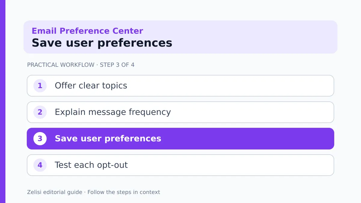
Selecting a topic does not always mean that a person gave valid permission for marketing. The rules depend on the message, relationship, country, and other facts. Store the evidence you need for your program and seek local legal advice where required.
If a person leaves all marketing, do not silently add them back because they bought a product or downloaded a file. A new action should not erase an earlier choice without a valid basis. Keep the process clear and traceable.
Only collect fields you need. A preference page usually does not need a date of birth, street address, or job title just to let someone choose a newsletter.
Write the confirmation in human language
After someone saves preferences, show a short message that says what changed. “You will get the weekly tips email” is more useful than “Request processed.” If the update may take time to apply, give a fair estimate and explain what to do if the next message arrives first.
Make the page readable with a keyboard and screen reader. Use clear labels, visible focus, and plain error messages. If the form fails, do not erase the person’s choices. Let them try again or offer a support path.
An email confirming the update can help in some cases, but do not turn it into an extra marketing message. The goal is to document the choice, not to create a new campaign.
Test the page in the languages your readers use. A translated label should still describe the exact topic or frequency that the system saves.
A small newsletter example
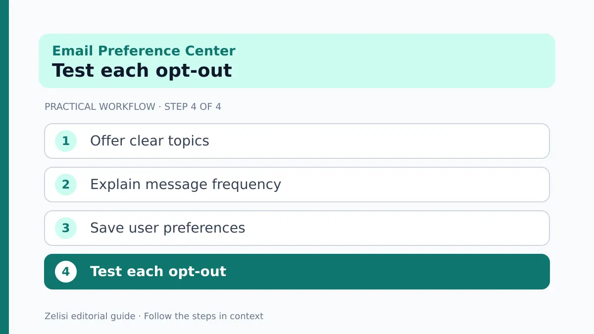
Imagine a site that sends three kinds of email: weekly how-to guides, new article alerts, and event invites. A reader likes the guides but feels buried by new article alerts. The site adds a preference page with those three choices and a one-click unsubscribe path.
The reader keeps the weekly guide and turns off the other two. The email team tests the change on a sample account. The next event message does not reach that account, while the weekly guide does. The confirmation page reflects the saved choice.
The site has not proved that the page will lift revenue or retention. It has shown that the reader’s request can be honored. The team can later measure how many people choose a smaller set of mail instead of leaving all messages.
That is the right order: first make the choice real, then measure whether it helps.
What to measure after launch
A practical setup and review
Track the number of people who visit the preference page, save a change, or unsubscribe. Look for form errors and complaints about unwanted mail. Compare patterns over time rather than making a claim from one small week.
A change in unsubscribe rate may reflect different campaigns, audience growth, or list cleanup. Do not credit the preference page for every shift. Check the kinds of messages sent and whether subscriber expectations were clear.
- Preference saves by topic or frequency.
- Full unsubscribe requests and whether they were honored.
- Failed form submissions or sync errors.
- Spam complaints and replies about unwanted mail.
- Subscriber feedback on clarity and ease of use.
Do not measure success only by keeping addresses on the list. A smaller list of people who want your content may be healthier than a large list that ignores every message.
Review the options as your program changes
Email programs change. A team may stop hosting events or add a product course. Update the preference page when those changes affect what subscribers can choose. Do not keep a checkbox for an email type that no longer exists.
Before a new campaign, ask whether it fits a current choice. If not, decide whether you need a new option or whether the message belongs in an existing one. Do not force every campaign into the broadest audience just because it is convenient.
Check the form after plugin, theme, and provider updates. Broken links and sync errors can undo a good policy in one release. Add the page to your normal website QA checks.
A preference center is successful when people understand their options, the system respects them, and the business sends fewer unwanted messages. Keep it small, clear, and honest.



One thought on “Email Preference Center: Let Subscribers Choose What They Receive”